SharePoint 2010: Branding Step by Step I
Hi..! SharePoint branding followers, this is step by step branding blogging is to help you people out of SharePoint branding issues. What we will be doing is will do complete branding top to bottom. First identifying a wireframe, building it to Photoshop Realistic Design, Converting Design into Working HTML, CSS and jQuery after that testing in Multiple Browsers and last not least Branding with SharePoint Designer 2010.
In SharePoint Designer 2010 we have lots of steps like creating a new master page, page layouts, modifying the CSS and jQuery.
Then creating custom themes with the office client, modifying themes in SharePoint Server. Planning site navigation and using non-SharePoint navigation, breadcrumb navigation and site map providers.
Ok will start our work right now.
Why Plan for Branding?
You guy can jump into SharePoint designer and start creating master pages for SharePoint 2010 but in a project environment that will be a mistake. The process of actually creating a brand in a SharePoint site involves several steps, including creating master pages, page layouts, CSS, and more. By effectively planning your branding before starting it, you have proactively considered exactly what you want to create and how it will be produced. Any adjustments or changes that are discovered during the planning process can be realized with much less effort than having to deal with them inside of SharePoint.
Requirements Analysis
Whether your SharePoint branding project is a site for 10 users or 10,000 users, certain requirements will undoubtedly need to be met. This is why the first step of almost any project, whether it is a SharePoint branding project or not, should be some amount of requirements analysis. Requirements analysis involves gathering and understanding the specific needs of a project. Typically this process includes asking a lot of questions and breaking larger problems into more manageable pieces to gain a better understanding of them.
Targeted Browsers and screen resolution
Another important decision to make is which browsers, operating systems and screen resolution will be targeted by your branding. Although many people may say that a website should support all browsers equally, it is often impractical to test each and every browser for pixel-perfect display. This is why it’s a good idea to decide early what browsers and operating systems will be supported by your SharePoint site. As mentioned earlier, this decision is typically much more important for public-facing Internet sites, for which you have no control over what browser users will be using to access the site. Currently, most web designers consider 1024 × 768 to be the most common screen resolution, followed closely by 1280 × 800.
Creating Wireframes
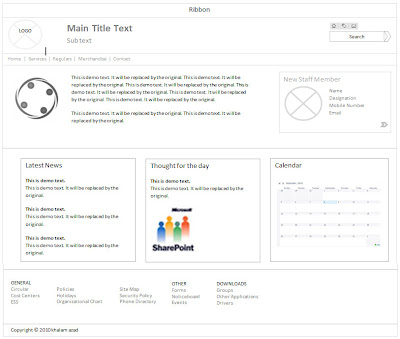
Wireframes are skeletal page designs; they capture the layout and flow of a website without focusing on colors and graphics. Guys, you people might be wondering why you should create a static, black-and-white wireframe when you plan to create a dynamic, full-color website. The major reason for creating wireframes before full-color comps is to ensure that all the stakeholders and decision makers focus on the layout and page flow, rather than get hung up on colour and images of published in site. Below figure shows wireframe that we are going to use for all practice.

I didn’t use any special tool to create the wireframe, it is not a major graphic work the tool I use to create the above wireframe is Microsoft word 2010 . Most of the work is done by Shapes tool under insert tab in the ribbon. I used the basic shapes and rectangle shapes to get above output. Below figure shows microsoft word tools used to create the wireframe.

Looking at the wireframes, note that not every single piece of SharePoint 2010 functionality is going to be included on this site. When creating wireframes for your SharePoint site, consider that not all of this functionality needs to be supported in your SharePoint branding. Also, it is important to remember all the different types of content that are supported in SharePoint 2010. Below figure shows the default SharePoint user interface (based on v4.master), with each of the major areas of functionality labeled.

The following table describes each of these major functional areas:

In SharePoint Designer 2010 we have lots of steps like creating a new master page, page layouts, modifying the CSS and jQuery.
Then creating custom themes with the office client, modifying themes in SharePoint Server. Planning site navigation and using non-SharePoint navigation, breadcrumb navigation and site map providers.
Ok will start our work right now.
Why Plan for Branding?
You guy can jump into SharePoint designer and start creating master pages for SharePoint 2010 but in a project environment that will be a mistake. The process of actually creating a brand in a SharePoint site involves several steps, including creating master pages, page layouts, CSS, and more. By effectively planning your branding before starting it, you have proactively considered exactly what you want to create and how it will be produced. Any adjustments or changes that are discovered during the planning process can be realized with much less effort than having to deal with them inside of SharePoint.
Requirements Analysis
Whether your SharePoint branding project is a site for 10 users or 10,000 users, certain requirements will undoubtedly need to be met. This is why the first step of almost any project, whether it is a SharePoint branding project or not, should be some amount of requirements analysis. Requirements analysis involves gathering and understanding the specific needs of a project. Typically this process includes asking a lot of questions and breaking larger problems into more manageable pieces to gain a better understanding of them.
Targeted Browsers and screen resolution
Another important decision to make is which browsers, operating systems and screen resolution will be targeted by your branding. Although many people may say that a website should support all browsers equally, it is often impractical to test each and every browser for pixel-perfect display. This is why it’s a good idea to decide early what browsers and operating systems will be supported by your SharePoint site. As mentioned earlier, this decision is typically much more important for public-facing Internet sites, for which you have no control over what browser users will be using to access the site. Currently, most web designers consider 1024 × 768 to be the most common screen resolution, followed closely by 1280 × 800.
Creating Wireframes
Wireframes are skeletal page designs; they capture the layout and flow of a website without focusing on colors and graphics. Guys, you people might be wondering why you should create a static, black-and-white wireframe when you plan to create a dynamic, full-color website. The major reason for creating wireframes before full-color comps is to ensure that all the stakeholders and decision makers focus on the layout and page flow, rather than get hung up on colour and images of published in site. Below figure shows wireframe that we are going to use for all practice.

I didn’t use any special tool to create the wireframe, it is not a major graphic work the tool I use to create the above wireframe is Microsoft word 2010 . Most of the work is done by Shapes tool under insert tab in the ribbon. I used the basic shapes and rectangle shapes to get above output. Below figure shows microsoft word tools used to create the wireframe.

Looking at the wireframes, note that not every single piece of SharePoint 2010 functionality is going to be included on this site. When creating wireframes for your SharePoint site, consider that not all of this functionality needs to be supported in your SharePoint branding. Also, it is important to remember all the different types of content that are supported in SharePoint 2010. Below figure shows the default SharePoint user interface (based on v4.master), with each of the major areas of functionality labeled.

The following table describes each of these major functional areas:


