SharePoint 2010: Branding Step by Step II
Creating Design Layout
Unlike wireframes, Design Layout are intended to be the final branding of the actual SharePoint site. creating Design Layout should include all of the things that make up a the final design, such as logo, colors, fonts, photos, resolution of the website and anything else that will appear on the final web solution.
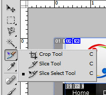
To create a realistic prototype, Microsoft Expression Design and Adobe Photoshop will help. This two design application are ideal. Below figure shows Adobe Photoshop tool used to create the Design Layout
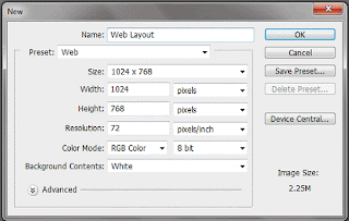
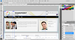 To obtain above design layout start with a new blank document. Use the following parameters for the Document as shown in the screenshot below.
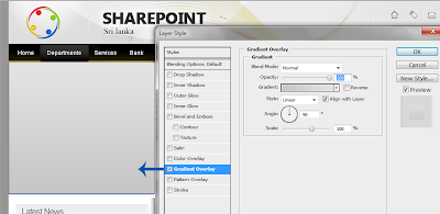
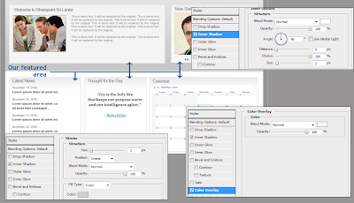
 before creating Our featured areas we need to create the home page gradient divider grid line in order to get some realistic effect. To do this,
Go to its Blending Options > Gradient Overlay top colour #c6c6c6 bottom colour #e3e3e3.
 Our featured area need some realistic effect for that we can use,
Blending Options > Inner Shadow white colour choke: 100%
next
select Blending Options > Colour Overlay: #f4f4f4 colour and
select Blending Options > Stroke size:1px, colour: #d1d1d1 and position: inside.
 In the footer section of the design layout you can put some related links, also the copyright details if you wish to contain.
 There we go... We are almost finished the layout designing (for this design layout I have font: "Arial". Heading font size 18pt, normal font size 11pt and sub heading 11pt bold, footer heading size 12pt.)
finally the design layout looks like!

Unlike wireframes, Design Layout are intended to be the final branding of the actual SharePoint site. creating Design Layout should include all of the things that make up a the final design, such as logo, colors, fonts, photos, resolution of the website and anything else that will appear on the final web solution.
To create a realistic prototype, Microsoft Expression Design and Adobe Photoshop will help. This two design application are ideal. Below figure shows Adobe Photoshop tool used to create the Design Layout
 To obtain above design layout start with a new blank document. Use the following parameters for the Document as shown in the screenshot below.

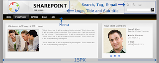
Before starting your design Layout leave 15px from left and right corners of the blank document for browser compatibility. This will help you at the time you create your Prototype.
Now we need to create the top header section of the page. this section, we will have the Sharepoint forum logo, title, sub title, search, tag, email and the basic menu. before creating Our featured areas we need to create the home page gradient divider grid line in order to get some realistic effect. To do this,
Go to its Blending Options > Gradient Overlay top colour #c6c6c6 bottom colour #e3e3e3.
 Our featured area need some realistic effect for that we can use,
Blending Options > Inner Shadow white colour choke: 100%
next
select Blending Options > Colour Overlay: #f4f4f4 colour and
select Blending Options > Stroke size:1px, colour: #d1d1d1 and position: inside.
 In the footer section of the design layout you can put some related links, also the copyright details if you wish to contain.
 There we go... We are almost finished the layout designing (for this design layout I have font: "Arial". Heading font size 18pt, normal font size 11pt and sub heading 11pt bold, footer heading size 12pt.)
finally the design layout looks like!

Look for "change the design layout into Working HTML and CSS, which helps you a lot in sharepoint conversion.", in next branding step by step III
further details about Photoshop you can go to below link:
http://sixrevisions.com/graphics-design/35-basic-tutorials-to-get-you-started-with-photoshop
http://www.psd.tutsplus.com
http://photoshoptutorials.ws
http://www.photoshopstar.com
further details about Photoshop you can go to below link:
http://sixrevisions.com/graphics-design/35-basic-tutorials-to-get-you-started-with-photoshop
http://www.psd.tutsplus.com
http://photoshoptutorials.ws
http://www.photoshopstar.com

Comments
Post a Comment